Data Visualisation
Design Research
Discombobulate - GIF's & Visual Culture during COVID
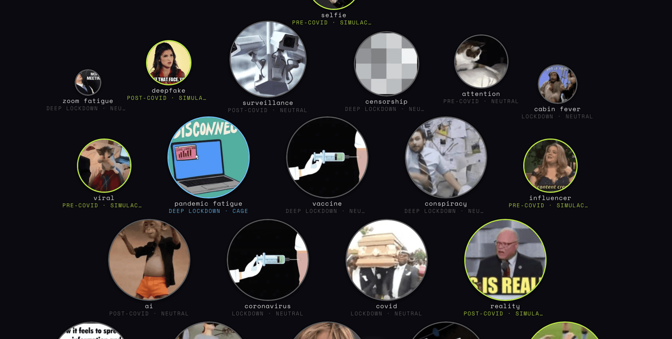
An interactive data visualisation exploring the gaze economy — how internet culture transforms lived experience into visual culture. Using the COVID-19 lockdown (2020–21) as its case study, the piece examines the moment the internet became the only window to reality, and what that did to how we feel, share, and eventually simulate emotion.
Theoretically grounded in McLuhan and Baudrillard, the piece draws on real GIF consumption data (Giphy API) mapped against pandemic keywords across four phases — epidemiological, policy, emotional, and cultural — to visualise how the scroll replaced the experience, and the meme replaced the feeling.
Built with D3.js, HTML/CSS/JS. Produced as part of a data visualisation programme at Cooper Union.
Client
Cooper Union
Year
2026
Sector
Media & Culture
The Context
During the COVID-19 lockdowns, the internet became the only shared window to reality. Grief, solidarity, boredom, rage — all of it mediated through screens, compressed into reaction GIFs and shared in group chats. The question: can you see the shape of a collective emotional shift in the data of what people searched for and consumed? And what does it mean when the scroll replaces the experience?
What I Built
An interactive visual essay — not a dashboard, a piece with a narrative arc — that maps real GIF consumption data pulled from the Giphy API against pandemic keywords across four overlapping phases: epidemiological, policy, emotional, and cultural. Theoretically grounded in McLuhan's media theory and Baudrillard's simulacra, the piece argues a specific point: that the gaze economy doesn't just reflect collective experience, it substitutes for it. Built with D3.js, HTML/CSS/JS as part of a data visualisation programme at Cooper Union.
Back