Product Design

GenAI

Africa Carbon Dashboard

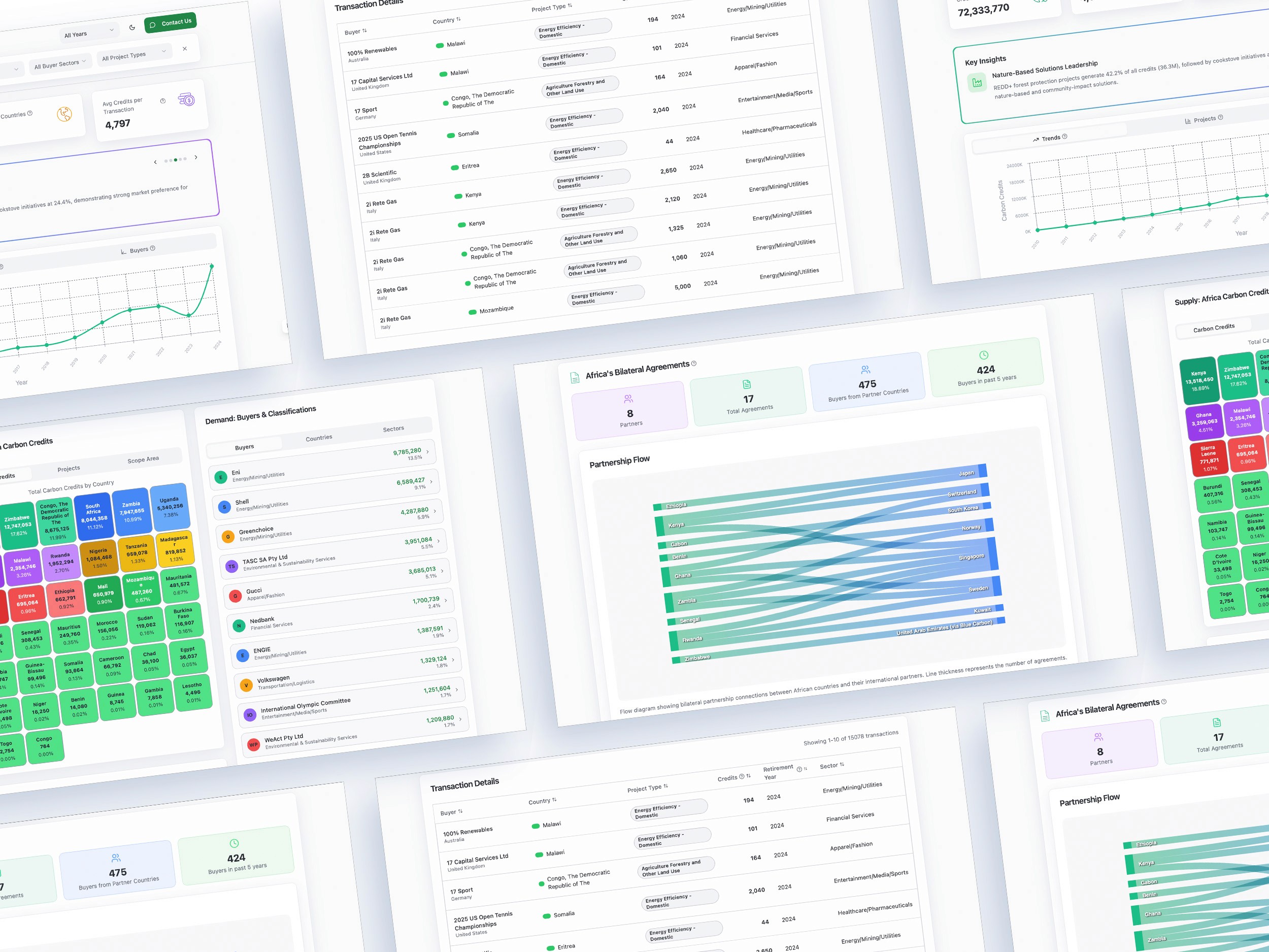
Built for FSD Africa, Catalyst Fund, and BFA Global, this analytics dashboard demystifies Africa's voluntary carbon credit market for researchers, policymakers, ESG analysts, and climate finance professionals. As the data visualisation and design lead, I handled data cleanup and designed the entire dashboard on Replit — translating raw market data into an interactive, navigable tool.

The result aggregates over 72 million transacted credits across 38 African countries, surfacing who's buying (European corporations like Eni, Shell, and Gucci dominate at 69.6%), which nations generate the most supply, what project types underpin credits (REDD+ leads at 42%), and how bilateral agreements flow under UNFCCC Article 6.2.


Client

FSD Africa

Year

2025

Sector

Climate & Sustainability

The Context

Africa's voluntary carbon market data lives in spreadsheets and paywalled platforms. Investors, startups, and buyers entering the space had no way to see where concentration was, which sectors had traction, or how credit flows were structured. Could we make it explorable?

What I Built

A filterable analytics dashboard visualising geographic distribution, buyer-seller flows, credit issuance over time, and bilateral agreement mapping across 38 countries. Data cleanup and prompt engineering via Claude, scaffolding via Replit, D3.js visualisations built from Observable HQ reference code. Several prototypes failed before one worked.

Key Findings

  • 64% — Credits concentrated in Kenya

  • 29 min — Average session time

  • 58% — Buyer concentration in top 10 purchasers

  • 85 — Organic users in 3 months, no promotion

Back